Overview
Purpose
The purpose of my site Dry Oar is to introduce white-water rafting to a beginner audience. I would like to provide tips on how to get started, the equipment needed to be successful, and to offer my services to lead the trip. I will have prices and information of locations on the website, I want it to be easy to navigate and to calm any fears someone might have. I do want to help get my business out there and to have people feel like it’s a safe, well-priced, and fun option to go with. Another purpose of the website is to introduce people to the community that can be found in white water rafting. I will have a spot where people can ask and answer different questions, connect with others, and build friendships. Overall, I want to grow my business and to open up the world of white-water rafting to everyone.
Audience
My target customers are going to be people who are brand-new or have minimal experience with white-water rafting. It’s going to range from a single person, a group of friends, or to a family using the website for the experience. They are going to be middle-class, fun, and adventure oriented. They want to learn a new skill or just to have a enjoyable experience for the sake of it. But they also want to be safe and to focus more on the thrill of white-water rafting and less on the dangers of it. Their needs that aren’t being met is detailed information. They might not know what white-water rafting really is, how to get started, the equipment needed, etc. I want my audience to access the site on all the options available. I want it to be desktop, laptop, and mobile friendly. But I would like to really focus on laptop and mobile because I feel like that will be the most common place where people will find the site.
Branding
Website Logo

Style Guide
Color Palette
Palette URL: https://coolors.co/b3dec1-dbf9f0-f7f9f7-2d2d34-a18276
| Primary | Secondary | Accent 1 | Accent 2 |
|---|---|---|---|
| #B3DEC1 | #DBF9F0 | #F7F9F7 | #2D2D34 |
Typography
Heading Font: Noto Sans JP
I chose this font because I wanted one that matched the type on my logo but one that would also be easy to read. I like how clean and simple it looks, and it conveys the idea of fun.
Paragraph Font: Nanum Myeongjo
I chose this font because I prefer to read paragraphs in a serif font. I liked that it didn’t feel too busy on the eyes in paragraph form but also looked professional. I also felt that it went with the heading font well.
Normal paragraph example
The best Whitewater Rafting in Colorado, White Water Rafting Company offers rafting on the Colorado and Roaring Fork Rivers in Glenwood Springs. Since 1974, we have been family owned and operated, rafting the Shoshone section of Glenwood Canyon and beyond.
Colored paragraph example
Trips vary from mild and great for families, to trips exclusively for physically fit and experienced rafters. No matter what type of river adventures you are seeking, White Water Rafting Company can make it happen for you.
Navigation
Site Map
The Site Map of a site is just like it sounds…it is a map of the pages in a site and how they are related and linked together. From the map above we can see that we will eventually have the Home page and 2 sub or child pages.
The lines that connect them all together indicate that each page should be accessible from any other page, it is essentially showing us the global navigation for the site.
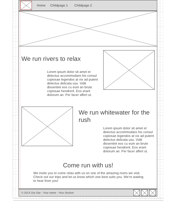
Wireframes
Wireframes are like blueprints for making webpages. They should show the major sections of content that will be on the page and the relative locations of each element. In the wireframe below you can see there will be 6 sections to our page:
- At the top we have a section with the logo (the box with the mountain means an image) and the navigation bar.
- Then there is a banner image that stretches all the way across the screen.
- Next we have some text and an image
- ...followed by another row made up of an image and some text.
- Then one more section of text with no image.
- Lastly, a footer containing a copyright/name line and 3 social media icons.